Have you ever wondered why some sites feel like a breeze on your phone while others make you want to toss your device? In today’s digital world, reaching your audience depends on how your site handles handheld traffic. Most people now browse the web using their phones while on the go.
If your page is slow or looks messy, visitors will leave for someone else immediately. Staying ahead requires a smart approach to mobile-friendly websites to keep your users happy and engaged. Search engines now favor responsive design and quick speeds above almost everything else.
Using these optimization steps helps your business rank better in search results. Good techniques make sure every visitor has a fun time regardless of their screen size. Let’s see how to improve your site for everyone.
Key Takeaways
- Prioritize responsive design for all users.
- Improve loading speeds to keep visitors.
- Focus on the experience for phone users.
- Simple navigation helps people find info.
- Higher speeds lead to better search ranks.
- Mobile-first indexing is now the standard.
Understanding Mobile-First Indexing and Its Impact
With the majority of users accessing websites through mobile devices, search engines have adapted by prioritizing mobile-first indexing. This approach means that search engines like Google predominantly use the mobile version of a website’s content for indexing and ranking purposes.
What Mobile-First Indexing Means for Your Website
Mobile-first indexing signifies a paradigm shift in how search engines evaluate websites. It implies that the mobile version of your site is considered the primary version. Therefore, it’s crucial that your website’s mobile version is as comprehensive and robust as its desktop counterpart.
To ensure a smooth transition to mobile-first indexing, website owners must verify that their mobile sites contain the same high-quality content as their desktop versions. This includes ensuring that all critical content, such as text, images, and structured data, is present and identical across both versions.
How Search Rankings Are Affected by Mobile Performance
The performance of your website on mobile devices directly impacts your search rankings. Factors such as page load speed, responsiveness, and overall user experience on mobile are critical. A slow or unresponsive mobile site can lead to higher bounce rates and lower search engine rankings.
Key factors influencing mobile performance include:
- Page load speed
- Mobile-friendliness and responsiveness
- User experience and interaction
The Shift from Desktop to Mobile Priority
The transition to mobile-first indexing reflects the broader shift in user behavior towards mobile devices. As more users rely on smartphones for browsing, the importance of optimizing for mobile has become paramount.
The table below highlights the key differences between desktop and mobile priorities in the context of search engine optimization:
| Aspect | Desktop Priority | Mobile Priority |
|---|---|---|
| Content | Often more comprehensive | Must be concise and accessible |
| Page Speed | Important but less critical | Crucial for user retention |
| User Experience | Focused on detailed interactions | Emphasizes simplicity and ease of use |

Implementing Responsive Design Principles
Responsive design is the cornerstone of a successful mobile optimization strategy, enabling websites to adapt seamlessly to different devices. This adaptability is crucial in today’s digital landscape, where users access websites through a variety of devices, from smartphones and tablets to desktop computers.
A well-implemented responsive design ensures that your website’s layout, content, and visual elements adjust automatically to fit the screen size and device type, providing an optimal user experience. This not only enhances user engagement but also improves search engine rankings, as search engines favor mobile-friendly websites.
Fluid Grid Layouts and Flexible Images
A fluid grid layout is a fundamental component of responsive design. It involves using relative units, such as percentages or ems, instead of fixed units like pixels, to define the width of layout elements. This allows the layout to adapt to different screen sizes and devices.
Flexible images are also essential in responsive design. By using CSS techniques, such as setting the max-width property to 100%, images can be made to scale proportionally with the layout, preventing them from overflowing or becoming distorted on smaller screens.

CSS Media Queries for Different Screen Sizes
CSS media queries are a powerful tool in responsive design, allowing you to apply different styles based on specific conditions, such as screen size or device type. By using media queries, you can tailor your website’s layout and appearance to different devices, ensuring an optimal user experience.
For example, you can use media queries to adjust the layout, font sizes, and image sizes based on the screen size, ensuring that your website looks great on both large desktop screens and small mobile screens.
Viewport Configuration Best Practices
The viewport meta tag is crucial in responsive design, as it controls how your website is displayed on mobile devices. By setting the viewport meta tag correctly, you can ensure that your website is scaled correctly and that users can zoom in and out as needed.
A common best practice is to set the width=device-width and initial-scale=1.0 attributes, which ensures that the website is displayed at the correct scale and that users can zoom in and out.
Testing Responsiveness Across Devices
Testing your website’s responsiveness across different devices and screen sizes is essential to ensure that it provides an optimal user experience. You can use various tools, such as browser developer tools or online responsiveness testing tools, to test your website’s responsiveness.
| Device Type | Screen Size | Responsive Design Features |
|---|---|---|
| Desktop | Large screens (≥ 1024px) | Multi-column layouts, large images |
| Tablet | Medium screens (768px – 1023px) | Adjusted layouts, resized images |
| Mobile | Small screens (≤ 767px) | Single-column layouts, smaller images |
By implementing these responsive design principles, you can create a mobile-friendly website that provides an optimal user experience across various devices and screen sizes.
Essential Mobile Optimization Techniques for Performance
With the majority of web traffic coming from mobile devices, optimizing for mobile performance is no longer optional. A well-optimized website not only enhances user experience but also improves search engine rankings, leading to increased visibility and engagement.
Image Optimization and Compression
Images are a significant contributor to page load times. Optimizing images is crucial for improving mobile performance. This involves choosing the right image formats and compressing images without compromising their quality.
Choosing the Right Image Formats
Different image formats serve different purposes. For instance, WebP offers superior compression compared to JPEG and PNG. Using the appropriate format can significantly reduce image file sizes.
Implementing Responsive Images
Responsive images adapt to different screen sizes and devices, ensuring that they are not unnecessarily large for smaller screens. This can be achieved using the srcset attribute in HTML.
Minifying CSS, JavaScript, and HTML
Minifying code involves removing unnecessary characters from CSS, JavaScript, and HTML files, reducing their size and improving load times. This process can be automated using various tools and plugins.
Leveraging Browser Caching
Browser caching allows frequently-used resources to be stored locally in a user’s browser, reducing the need to reload them on subsequent visits. This can significantly improve page load times for returning visitors.
Reducing Server Response Time
Server response time is a critical factor in page load times. Optimizing server response time can be achieved by improving server hardware, optimizing database queries, and leveraging content delivery networks (CDNs).
Page Speed Optimization Strategies
With the majority of users accessing websites through mobile devices, page speed has become a critical aspect of mobile optimization. A fast-loading website not only improves user experience but also significantly impacts search engine rankings. In this section, we will explore various page speed optimization strategies that can enhance your website’s performance.
Implementing Lazy Loading for Images and Videos
Lazy loading is a technique that defers the loading of non-critical resources, such as images and videos, until they are actually needed. This approach can significantly reduce the initial payload of your webpage, resulting in faster load times. By implementing lazy loading, you can improve the overall user experience, especially for users with slower internet connections.
Benefits of Lazy Loading:
- Reduced initial page load time
- Improved user experience
- Lower bandwidth consumption
Using Content Delivery Networks
A Content Delivery Network (CDN) is a distributed network of servers that deliver web content to users based on their geographic location. By caching your website’s content across different servers worldwide, a CDN can significantly reduce the distance between your users and your website’s resources.
How CDNs Improve Load Times
CDNs improve load times by reducing the latency associated with fetching resources from a distant server. By caching content at edge locations closer to your users, CDNs ensure that resources are delivered quickly, regardless of the user’s location.
Selecting the Right CDN Provider
When selecting a CDN provider, consider factors such as server coverage, pricing, and ease of integration with your existing infrastructure. Some popular CDN providers include Cloudflare, Akamai, and Verizon Digital Media Services.
| CDN Provider | Server Coverage | Pricing |
|---|---|---|
| Cloudflare | Global | Free, Paid plans available |
| Akamai | Global | Custom pricing |
| Verizon Digital Media Services | Global | Custom pricing |
Eliminating Render-Blocking Resources
Render-blocking resources, such as CSS and JavaScript files, can significantly delay the rendering of your webpage. By optimizing the delivery of these resources, you can improve your website’s load times and overall performance.
Techniques for eliminating render-blocking resources include:
- Minifying and compressing CSS and JavaScript files
- Using async and defer attributes for JavaScript files
- Inlining critical CSS
Optimizing Critical Rendering Path
The Critical Rendering Path (CRP) refers to the sequence of events required to render a webpage. Optimizing the CRP involves minimizing the number of critical resources, reducing the size of critical resources, and optimizing the order in which they are loaded.

By implementing these page speed optimization strategies, you can significantly improve your website’s load times and provide a better user experience for your visitors.
Mobile SEO Best Practices
Mobile SEO is no longer a nicety, but a necessity for businesses aiming to stay competitive in the digital landscape. As search engines continue to prioritize mobile-friendly websites, adopting mobile SEO best practices is crucial for improving your website’s visibility and driving more traffic to your site.
Optimizing Meta Tags for Mobile Search
Optimizing meta tags is a fundamental aspect of mobile SEO. Ensure that your title tags are concise and descriptive, as they appear in search engine results pages (SERPs). According to Google, title tags should be no more than 60 characters to avoid truncation. Meta descriptions should also be compelling and within the 160-character limit to entice users to click through.
Structured Data and Schema Markup Implementation
Implementing structured data and schema markup helps search engines understand your website’s content and context. This can enhance your search listings with rich snippets, improving click-through rates. For instance, using schema markup for reviews can display star ratings directly in search results, making your listing more attractive.
“Structured data is a standardized format for providing information about a page and classifying the page content.” –
Mobile-Friendly URL Structures
A mobile-friendly URL structure is simple, clean, and easy to navigate. Avoid using long, complex URLs with unnecessary parameters. Instead, opt for short, descriptive URLs that include target keywords. This not only improves user experience but also helps search engines crawl and index your site more efficiently.

Local SEO Considerations for Mobile Users
For businesses with a physical presence, local SEO is vital. Mobile users often search for local information, such as store hours, directions, or contact details. Ensure your website is optimized for local search by including your business’s name, address, and phone number (NAP) consistently across the web and on local directories. Claiming and optimizing your Google My Business listing is also essential.
Designing Touch-Friendly User Interfaces
With the majority of users accessing websites through mobile devices, designing touch-friendly interfaces has become a necessity. A touch-friendly interface is essential for providing a good user experience on mobile devices, directly impacting user engagement and bounce rates.
To create a touch-friendly interface, several key elements must be considered. These include button sizing and spacing, navigation menu optimization, and form design, all of which play a crucial role in enhancing the mobile user experience.
Button Sizing and Spacing Guidelines
Buttons are a critical component of any user interface, and their design can significantly affect the usability of a mobile website. Buttons should be large enough to be easily tapped without accidentally triggering adjacent buttons. The recommended minimum size for touch targets is 44×44 pixels, as suggested by Apple’s Human Interface Guidelines.
Spacing between buttons is equally important. Adequate spacing helps prevent accidental clicks on the wrong button, reducing user frustration and improving overall interaction with the website.
| Button Size | Recommended Use |
|---|---|
| 44×44 pixels | Minimum size for touch targets |
| 48×48 pixels | Ideal size for most mobile interfaces |
| Larger sizes | For critical actions or for devices with larger screens |
Navigation Menu Optimization for Mobile
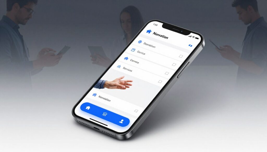
Navigation menus on mobile devices require careful optimization to ensure they are both accessible and do not overwhelm the user. Two popular approaches to mobile navigation are hamburger menus and tab bars.
Hamburger Menus vs. Tab Bars
Hamburger menus are a popular choice for mobile navigation as they conserve screen space by hiding the menu behind an icon. However, they can be less discoverable, potentially hiding important navigation options from users.
Tab bars, on the other hand, provide quick access to main navigation options but can become cluttered if too many tabs are included. The choice between these two options depends on the specific needs and complexity of the website.
Sticky Navigation Implementation
Sticky navigation, where the navigation menu remains visible at the top of the screen even as the user scrolls, can enhance usability by providing constant access to navigation options. However, it should be implemented carefully to avoid obscuring content on smaller screens.
Form Design for Mobile Devices
Forms on mobile devices need to be designed with care to ensure they are easy to fill out. This includes using large enough input fields, minimizing the number of required fields, and optimizing the keyboard layout for the type of data being entered.
For example, using auto-fill capabilities and smart form fields that adapt to the user’s input can significantly improve the form-filling experience on mobile devices.
Optimizing Content for Mobile Screens
As mobile devices continue to dominate internet traffic, the importance of mobile-friendly content cannot be overstated. Optimizing content for mobile screens is critical for providing a good user experience and improving engagement.
Typography and Readability Best Practices
When it comes to mobile optimization techniques, typography plays a crucial role in readability. Choosing the right font size and style can significantly enhance the user experience on smaller screens.
For optimal readability, it’s recommended to use clear, sans-serif fonts like Arial or Helvetica. Font sizes should be large enough to be easily readable without zooming, typically between 14px and 18px for body text.
Line spacing is also vital; adequate spacing between lines (at least 1.5 times the font size) helps prevent the content from appearing cluttered.
Content Hierarchy and Formatting
A well-structured content hierarchy is essential for responsive design. Headings, subheadings, and paragraphs should be clearly defined to guide the reader through the content.
Using header tags (H1, H2, H3, etc.) helps in organizing the content and improving SEO. It’s also important to keep paragraphs concise and focused on a single idea.
Video and Multimedia Optimization
Multimedia content, such as videos and images, can significantly enhance the user experience on mobile devices. However, they must be optimized to prevent slow loading times.
Compressing videos and using formats like MP4 can help reduce file sizes without compromising quality. Additionally, using lazy loading for multimedia content can improve page load times.
Managing White Space Effectively
White space, also known as negative space, is crucial for a clean and intuitive mobile design. It helps in reducing clutter and improving the overall user experience.
Effective use of white space around buttons, images, and text can make the content more readable and engaging. It’s also important to balance white space with content to avoid a sparse or empty feel.
Eliminating Mobile Usability Issues
As mobile devices become increasingly dominant, eliminating usability issues on mobile websites is more important than ever. A mobile-friendly website is crucial not only for user satisfaction but also for search engine optimization (SEO). Mobile usability issues can lead to high bounce rates, negatively impacting your site’s performance in search engine rankings.
“Mobile usability is no longer a nicety, it’s a necessity,” as emphasized by Google’s mobile-first indexing approach. Ensuring that your website is optimized for mobile devices is vital for providing a good user experience and improving your search engine rankings.
Avoiding Intrusive Interstitials and Pop-ups
Intrusive interstitials and pop-ups can significantly hinder the user experience on mobile devices. These elements can obscure the main content, making it difficult for users to navigate your site. According to Google, interstitials that cover a significant portion of the screen can lead to a penalty in search rankings.
To avoid this issue, consider using alternative methods to display important information, such as using a banner or a non-intrusive notification. This approach not only improves user experience but also helps in maintaining your site’s search engine ranking.
Fixing Horizontal Scrolling Problems
Horizontal scrolling can be frustrating for mobile users, as it often results from elements on the page that are too wide for the screen. To fix this, ensure that your website’s design is responsive and adapts to different screen sizes.
Using CSS media queries can help adjust the layout based on the device’s screen size, preventing horizontal scrolling. Additionally, testing your website on various devices can help identify and fix such issues.
Managing Overlays and Modal Windows
Overlays and modal windows, when used correctly, can be effective tools for capturing user attention. However, if not managed properly, they can be intrusive and negatively impact the user experience.
Best practices include ensuring that these elements are easy to dismiss and do not cover the main content. Also, consider the timing of when these elements appear; for instance, displaying them after a user has engaged with your content can be less intrusive.
Addressing Common Touch Target Errors
Touch target errors occur when interactive elements like buttons are too small or too close together, making it difficult for users to tap on them accurately. To address this, ensure that touch targets are sufficiently large and spaced apart.
Google recommends that touch targets should be at least 48×48 pixels in size and have a minimum spacing of 8 pixels between them. By following these guidelines, you can improve the usability of your mobile website and enhance the overall user experience.
By addressing these common mobile usability issues, you can significantly improve your website’s user experience and, consequently, its search engine ranking. Ensuring that your website is mobile-friendly is an ongoing process that requires regular testing and optimization.
Testing and Measuring Mobile Performance
To guarantee a smooth mobile experience, it’s essential to test and measure your website’s performance regularly. This involves using various tools and techniques to identify areas of improvement and ensure your website is optimized for mobile devices.
Google Mobile-Friendly Test and PageSpeed Insights
Google provides two essential tools for testing mobile performance: the Mobile-Friendly Test and PageSpeed Insights. The Mobile-Friendly Test checks if your website meets Google’s criteria for mobile-friendliness, while PageSpeed Insights analyzes your website’s performance on both desktop and mobile devices, providing scores and recommendations for improvement.
Interpreting PageSpeed Scores
PageSpeed Insights provides a score out of 100 for both mobile and desktop versions of your website. A higher score indicates better performance. The score is based on various factors, including image optimization, minification of CSS and JavaScript, and server response time.
Addressing Common Issues Identified
Common issues identified by PageSpeed Insights include unoptimized images, render-blocking resources, and slow server response times. Addressing these issues can significantly improve your website’s performance. For example, optimizing images can reduce page load times, while minifying CSS and JavaScript can improve rendering efficiency.
| Issue | Recommendation | Impact |
|---|---|---|
| Unoptimized Images | Compress images using tools like TinyPNG or ImageOptim | Reduced page load times |
| Render-Blocking Resources | Minify CSS and JavaScript, use async or defer attributes | Improved rendering efficiency |
| Slow Server Response Time | Optimize server configuration, leverage browser caching | Faster page loads |
Core Web Vitals Monitoring
Core Web Vitals are a set of metrics that measure the user experience of a website, focusing on loading performance, interactivity, and visual stability. Monitoring these vitals is crucial for ensuring a good user experience.
Largest Contentful Paint Optimization
The Largest Contentful Paint (LCP) measures the time it takes for the largest content element to become visible within the viewport. Optimizing LCP involves ensuring that the largest content element is loaded quickly, typically by optimizing images and server response times.
First Input Delay and Cumulative Layout Shift
First Input Delay (FID) measures the time it takes for a website to become interactive, while Cumulative Layout Shift (CLS) measures the visual stability of a website. Improving FID involves optimizing JavaScript execution, while improving CLS involves ensuring that layout shifts are minimized during page loading.
Real User Monitoring and Analytics
Real User Monitoring (RUM) involves collecting data on how real users interact with your website, providing insights into performance issues that may not be apparent in synthetic testing. Tools like Google Analytics can be used to monitor user behavior and identify areas for improvement.
By combining the insights from Google’s testing tools, Core Web Vitals monitoring, and Real User Monitoring, you can gain a comprehensive understanding of your website’s mobile performance and make data-driven decisions to improve it.
Conclusion
As the digital landscape continues to evolve, having a mobile-friendly website is no longer a luxury, but a necessity. By implementing effective mobile optimization techniques, you can significantly improve your website’s usability and performance, leading to a better user experience and improved search engine rankings.
Throughout this article, we’ve explored various mobile optimization techniques, from responsive design principles to page speed optimization strategies. We’ve also discussed the importance of mobile SEO best practices and testing and measuring mobile performance. By applying these techniques, you can ensure your website remains optimized for the ever-evolving mobile landscape.
To stay ahead of the curve, it’s essential to continuously monitor your website’s mobile performance and make adjustments as needed. By doing so, you’ll be able to provide a seamless user experience for your mobile users, driving engagement and ultimately, conversions. With a mobile-friendly website, you’ll be well on your way to achieving your online goals.
FAQ
What exactly is mobile-first indexing and how does it affect my site’s visibility?
Mobile-first indexing means that Google predominantly uses the mobile version of your content for indexing and ranking. Since most users now access the web via smartphones, Googlebot crawls your mobile site first to determine how your pages should rank. If your mobile experience is lacking, your search engine placement could drop, making it essential to prioritize mobile SEO best practices from the ground up.
Is responsive design better than having a separate “m.” mobile subdomain?
Yes, in almost every case, responsive design is the superior choice. It allows your website to fluidly adapt to any screen size, whether a user is on an Apple iPhone, a Samsung Galaxy, or a Microsoft Surface. This approach eliminates the risk of duplicate content and makes SEO for mobile much simpler, as you only have one set of URLs for search engines to crawl.
Which mobile optimization techniques are most effective for improving load times?
To see a real difference in performance, you should focus on image compression, minifying your CSS and JavaScript, and leveraging browser caching. Additionally, implementing lazy loading ensures that images and videos only load as the user scrolls down, which significantly boosts your initial page speed optimization scores on tools like PageSpeed Insights.
How can I ensure my mobile-friendly websites are easy for users to navigate?
Focus on creating a touch-friendly interface. This includes using large button sizes (at least 44×44 pixels) and providing ample spacing to prevent “fat-finger” errors. Consider using a sticky navigation bar or a well-organized hamburger menu to keep essential links accessible without cluttering the small screen. These mobile optimization techniques help reduce bounce rates and keep users engaged.
What role does a Content Delivery Network (CDN) play in page speed optimization?
A CDN, such as Cloudflare or Akamai, stores copies of your website on servers located all around the world. When a mobile user accesses your site, the data is pulled from the server closest to them. This reduces latency and speeds up the delivery of assets, which is crucial for maintaining high-performance mobile-friendly websites on slower cellular networks.
Are there specific mobile SEO best practices for local businesses?
Definitely! Local searches are incredibly common on mobile devices. You should implement Structured Data and Schema Markup to help Google understand your location, business hours, and services. Ensuring your phone number is “click-to-call” and your address links directly to Google Maps are vital steps in optimizing your SEO for mobile for local customers.
How do I identify and fix mobile usability issues?
The best way to start is by using the Google Search Console Mobile Usability report. It will flag common problems like text that is too small to read, content wider than the screen, or intrusive interstitials (pop-ups) that block the user experience. Addressing these issues is a core part of modern mobile optimization techniques and ensures a seamless journey for your visitors.
What are Core Web Vitals, and why do they matter for mobile?
Core Web Vitals are a set of specific factors that Google considers important in a webpage’s overall user experience. They include Largest Contentful Paint (LCP) for loading performance, First Input Delay (FID) for interactivity, and Cumulative Layout Shift (CLS) for visual stability. Improving these metrics through rigorous page speed optimization is now a key ranking factor in SEO for mobile.

I am an SEO expert with over 7+ years of hands-on experience in search engine optimization, content strategy, and organic growth. I specialize in creating SEO-driven blog content that helps businesses improve search visibility, attract qualified traffic, and achieve sustainable rankings on Google. With a strong understanding of on-page SEO, keyword research, technical SEO, and content optimization, I focus on delivering data-backed, user-focused content that converts.
Related Posts

Get Expert SEO Service in Dhamnar – Call +91 8839797476
Are you looking to boost your online presence? Expert SEO…

Expert SEO Service in Hanmatiya
Welcome to our expert SEO service, where we specialize in…
Indore SEO Solutions: Elevate Your Online Presence
I help local businesses cut through growing competition with practical…